
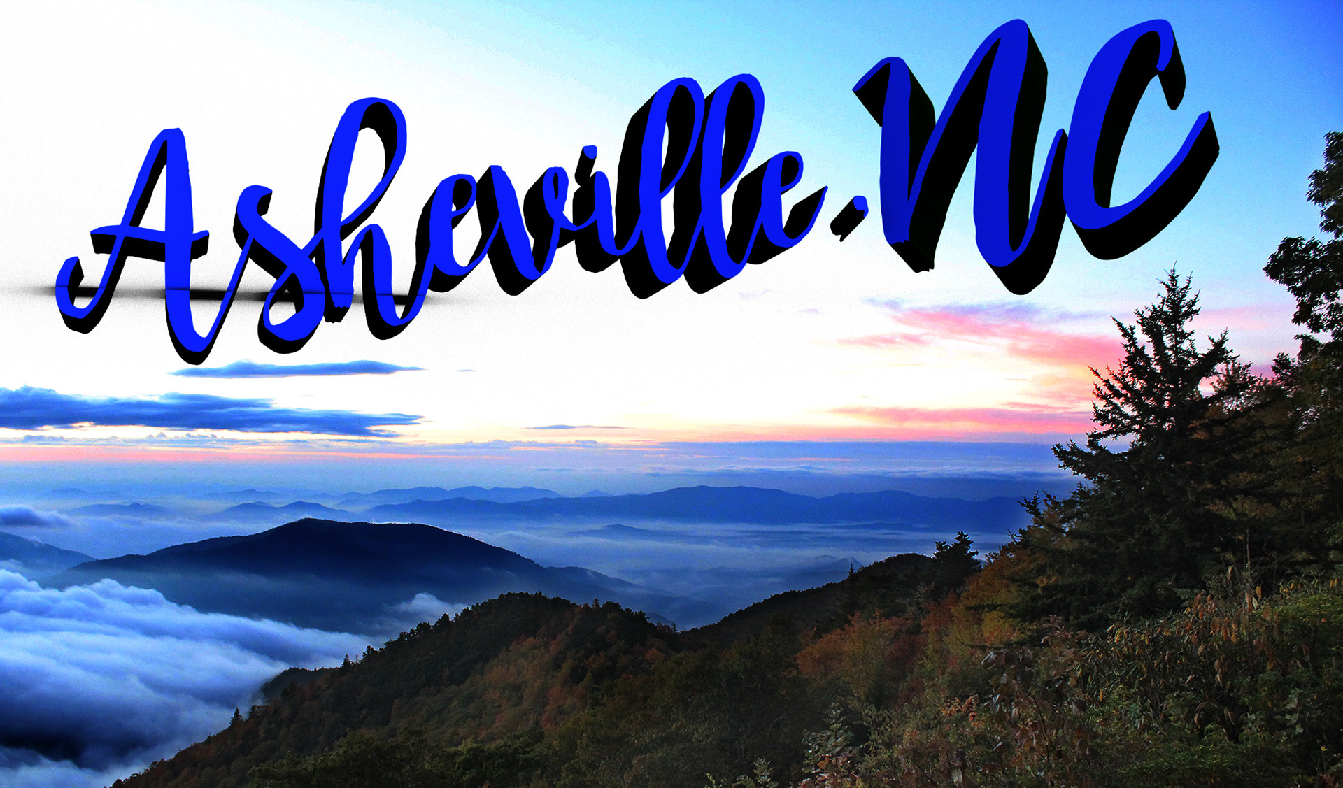
For the first project, I used the text tutorial in the book as inspiration. Since my side business is selling essential oils, I wanted to do something for that. Essential oils are all about plants and nature, so I chose a leaf background. I also chose my favorite font, laser metal. I followed the tutorial pretty closely to increase the bump of the background. I also added a curved cap to the text and I increased the shine and reflection to make it look shiny. For the image based light, I chose an image of water droplets to go with the idea of the oils. This made my text look really oily and shiny which is cool. I changed the angle of the camera and added the gradient to cover up the edges that were exposed. For my second project, I followed the second tutorial about adding text to a photo. I think it is a cool concept and it reminded me of how a postcard would look, so I wanted to make a postcard for Asheville. I used one of my photos that I took outside of Asheville as the background and there was a great blank space in the sky for the text. I used a script font which limited how much I could move around the individual letters in the camera angle. I ended up rotating both the Asheville and the NC on the Y axis on separate angles so it looked a little more deep. When I rendered the final image it kind of messed up my background image; I'm not sure why. It added some black in the sky but I don't know how that happened. I think it looks like a cool postcard for Asheville.