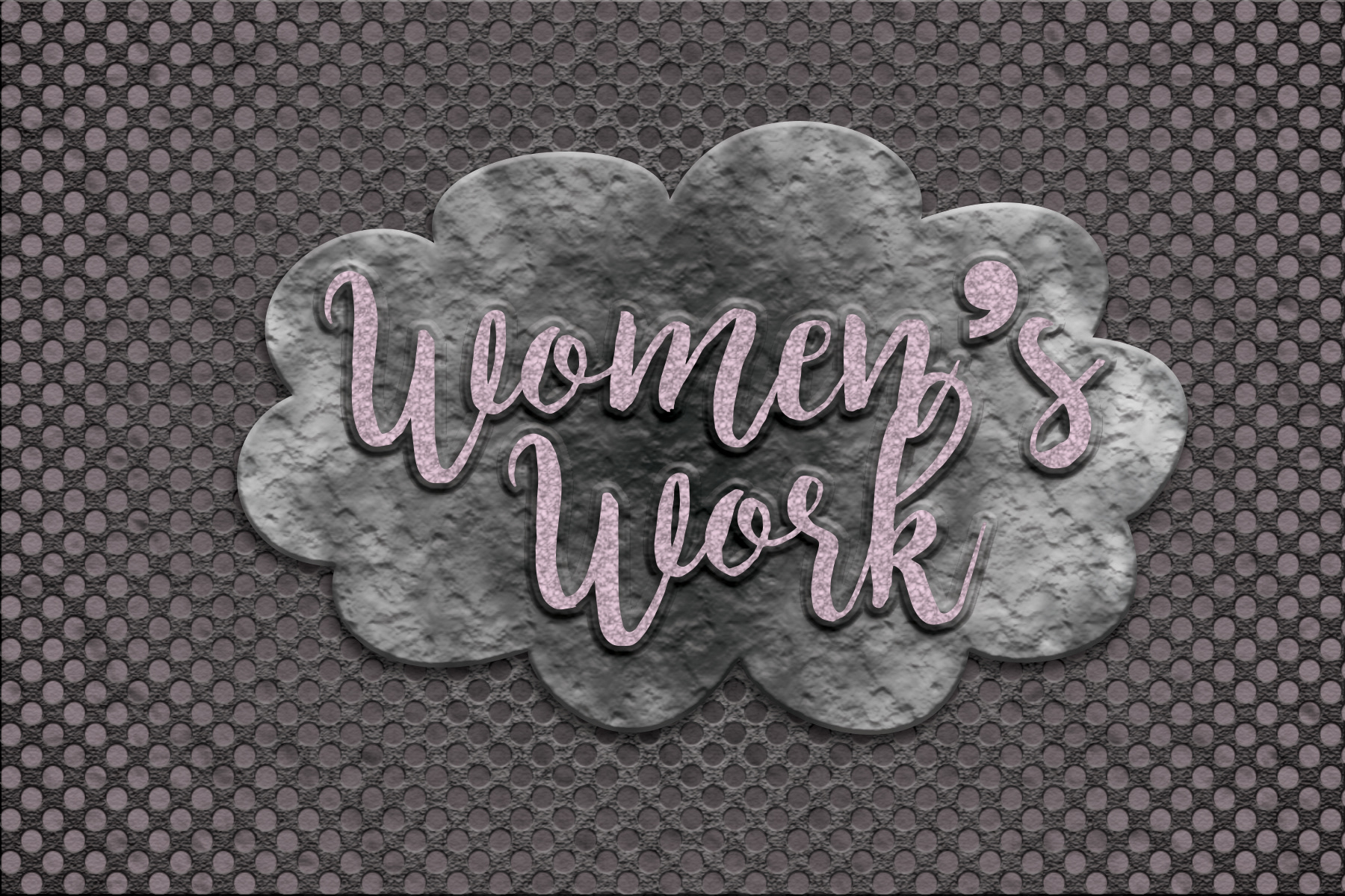
I was inspired by the tutorial because it looked like a logo for a really "manly" product line, like power tools or something. I wanted to keep the use of the perforated texture, which maintains the "tool" or "construction" vibe. But, I wanted to put a twist on the notion of that type of work being only for men. Last night I patched a hole in my tire with the help of my friend (yes, he is a man, but still) and I felt very accomplished. I wanted to run with that idea of women being able to accomplish any task (realistically, I would not have been able to fix the tire by myself, but again, not the point). So I made a fake brand called "Women's Work" to play with the phrase which implies that certain tasks are only for women, and also the word "work," which is usually associated with physical work. So I feminized the textures and used a satin texture and a cloud texture in the different elements of my image. I used a cloud shape to make the image more feminine and a light pink hue to evoke further femininity. I played with the beveling and gradient to the best of my ability. I used a really cool font I like called Ultra, which I think is both bold and playful. This company could sell products which empower women to do tasks on their own, or something like that.